Kobold Dungeon Tester
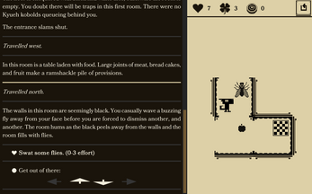
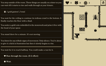
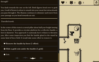
This is a mix of a roguelike and a multiple choice text-adventure. You play a kobold testing a dungeon.
Shelved
Unfortunately the scope of the project became too big to handle alone so I chose to shelve it. I've uploaded the source code to Github:
https://github.com/st33d/kobold-dungeon
Project Resurrected
I've reused a lot of content from this game to make a new and finished one:
Please go play that instead.
I'm leaving this page up so you can experience how the rules and story changed.
| Status | On hold |
| Platforms | HTML5, Windows, macOS |
| Rating | Rated 4.8 out of 5 stars (13 total ratings) |
| Author | st33d |
| Genre | Interactive Fiction |
| Made with | Unity |
| Tags | Dungeon Crawler, inkle, Roguelike, Roguelite, Text based |
Development log
- ShelvedDec 16, 2019
- Redraft 3: WisdomOct 30, 2019
- DesktopJun 10, 2019
- A Lick of PaintJun 06, 2019
- GoldJan 29, 2019
- Death and RebirthDec 20, 2018
- Android BuildOct 20, 2018
- Gates, Keys, and LuckOct 18, 2018


Comments
Log in with itch.io to leave a comment.
LMAO 10/10 GAME
This is still really cool. Great work even after all these years haha
I'm making a kobold themed (physical) card game right now, so I searched Itch to see what others had done with the little guys.
That led me here, and I'm glad that it did. I really like this! Even though it's just a discontinued demo, I'm glad that you made this. It's brimming with character and really well put together. Meeting the troll was a highlight of my run.
This is extremely cool. The English is not too hard for a non native speaker like me yet elaborate enough to give a feeling of actually playing a pen and paper RPG.
You just created the roguelike of my dreams, I often fantasized of creating something like this.
Thank you for this game I'll follow it!
EDIT: I just saw that you also are the creator of Ending and Red Rogue! Two great games! Please don't let Kobold Dungeon Tester on the side for other projects too long. ;)
Amazing game! A dungeon crawler with adventure game like descriptions! Very Nice!
Is it possible to move the text at the bottom of the screen instead at the top? Or at least put a settings option so we can change it... As it is now it seem weird with the graphics at the bottom and the text-interaction at the top!
Edit:
I have tested your game on my Nokia 6.1 and it works OK! The main thing is that the UI problem that I have mentioned above is even more prominent on a mobile phone especially one with >5 inches since your hand must travel to the top of the screen in order to select a choice!
Cheers. Will add some UI config options after I’ve finished writing more rooms, and experiment with alternate layouts.